From spark to structure.
Everything that makes Spark Hive look, sound, and feel like Spark Hive. One palette. One voice. One hand-drawn system. Analog soul in a digital world.
The essentials, on one page
Six colors and four faces carry the whole brand. Tokens live in colors_and_type.css — link styles.css and you have all of it.
Palette
Correct the deprecated #6B46C1 and #FFB800 on sight.
Typography
Nunito does the work. The others are seasoning.
Nunito BlackBold → Black, purple by default
Lora italicPull quotes and long-form reading
Shadows Into LightMargin notes and sticky labels — never body
Raleway DotsALL-CAPS, one per composition. Spice only.
Two words, one deliberate split
The name is spark hive — always lowercase, always two words, always rendered with a deliberate weight and color split.
#471C78#F6A900The default on white and paper grounds. Purple "spark", gold "hive".
Cosmic Purple surfaces only. Both words white — the Bold / Light split carries the contrast.
Tatiana, talking to one person over coffee
Warm, precise, a little playful. Never corporate. Every quality has a shadow it must stay clear of.
“From spark to structure. One notebook. One system. One week.”
Short declarative sentences. Second person. Sentence case. Named phrases reused verbatim.
The loudest instrument we own
Hand-drawn PNGs with visible crayon grain. Each one is a metaphor, not a UI glyph. Give them 32–96px of breathing room and never redraw them.
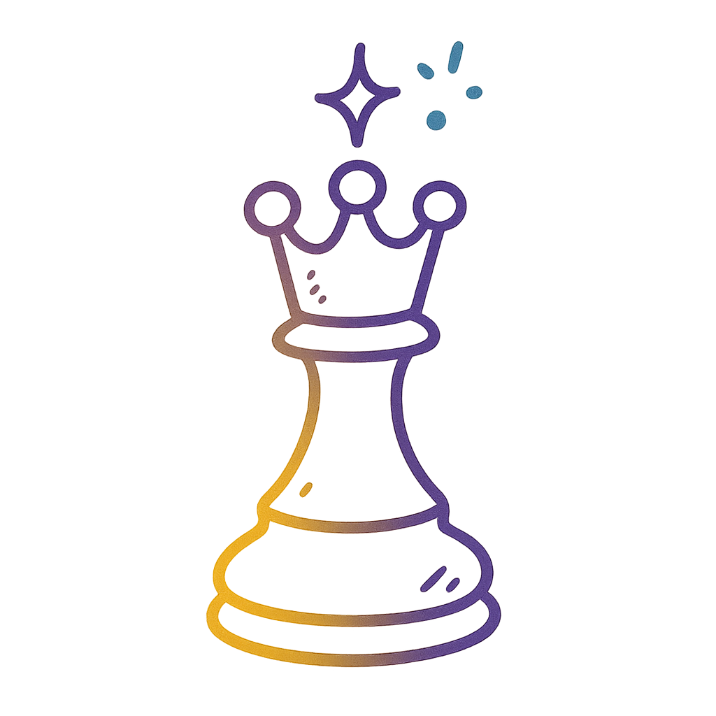 Queen's MoveStrategy, decisions
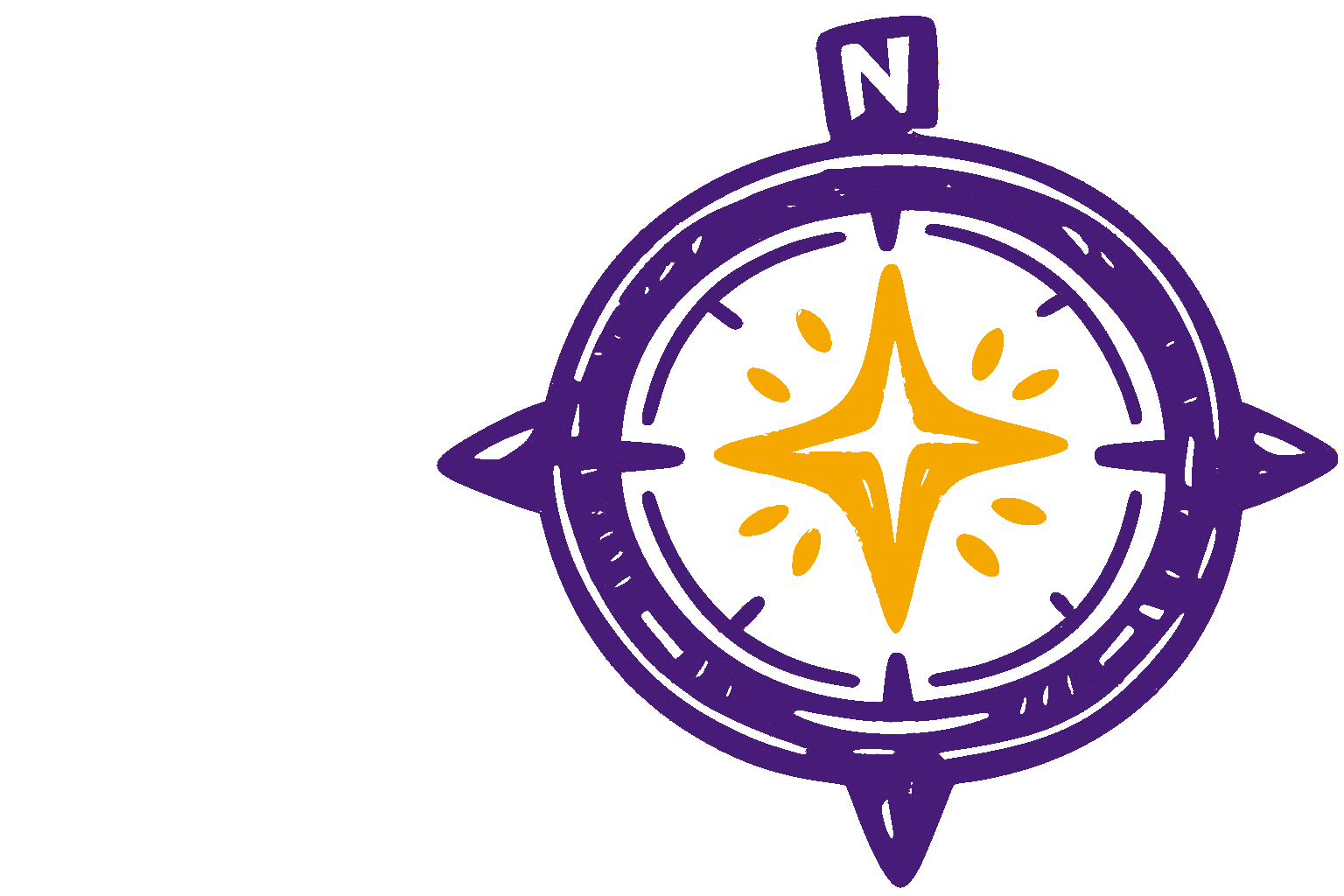 North Star CompassVision, clarity
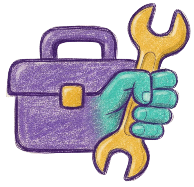 Builder's BoxImplementation
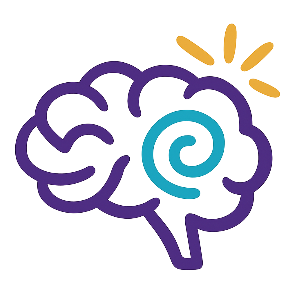 Spark BrainThe spark moment
 The BeeHive and team
Every card in the system
Each reference card opens on its own. Filter by group to find what you need.
Don't start from a blank page
Ready-made templates that already follow every rule. Copy, fill, ship.

Slide deck
Title, section, quote, framework, comparison and CTA layouts at 16:9 — keyboard-navigable and auto-scaling.
Open the deck
Video overlay kit
Nine overlays for the talking-head series at true 1920×1080. The centre 46% of frame always belongs to the speaker.
Open the overlays
Canva templates
Six required template wireframes and four starting grids for social content that stays on-system.
See the templatesInside the lines, outside the electric fence
Run every asset past both lists. If it fails one, it isn't done.
Always
Required on every asset.
- Logo top-left — never centered, never rotated.
- Paper grounds only: dot grid, graph paper, or plain white.
- Gold CTAs on purple, purple CTAs on white.
- The wordmark is two words, all lowercase: spark hive.
- Text layered in post, never baked into images.
Never
Hard no's that break the brand.
- Corporate Memphis, stock handshakes, suited office scenes.
- Cream, beige, or off-yellow paper. Coffee rings and distress.
- 3D clay renders — the pre-made 3D icons are the only exception.
- Emoji. Use the gold spark ✦ instead.
- Glassy blur, neumorphism, bouncy springs.